

A modern brand refresh that wouldn’t break the bank.
Grace Church (Roseville) needed a brand update to convey their recent transformation. New leadership = new chapter! The refresh had to be financially thoughtful (i.e., a slower, more subtle rollout), as their budget couldn’t support a full overhaul of existing materials.
Through discovery with staff & leadership, I identified young families as their most beneficial target audience; this demographic could seamlessly grow with the church through new life transitions and major milestones. Young families are looking for a modern, relatable church and I kept these attributes in mind. It was also important for Grace to retain the brand equity they'd already established with their loyalists.
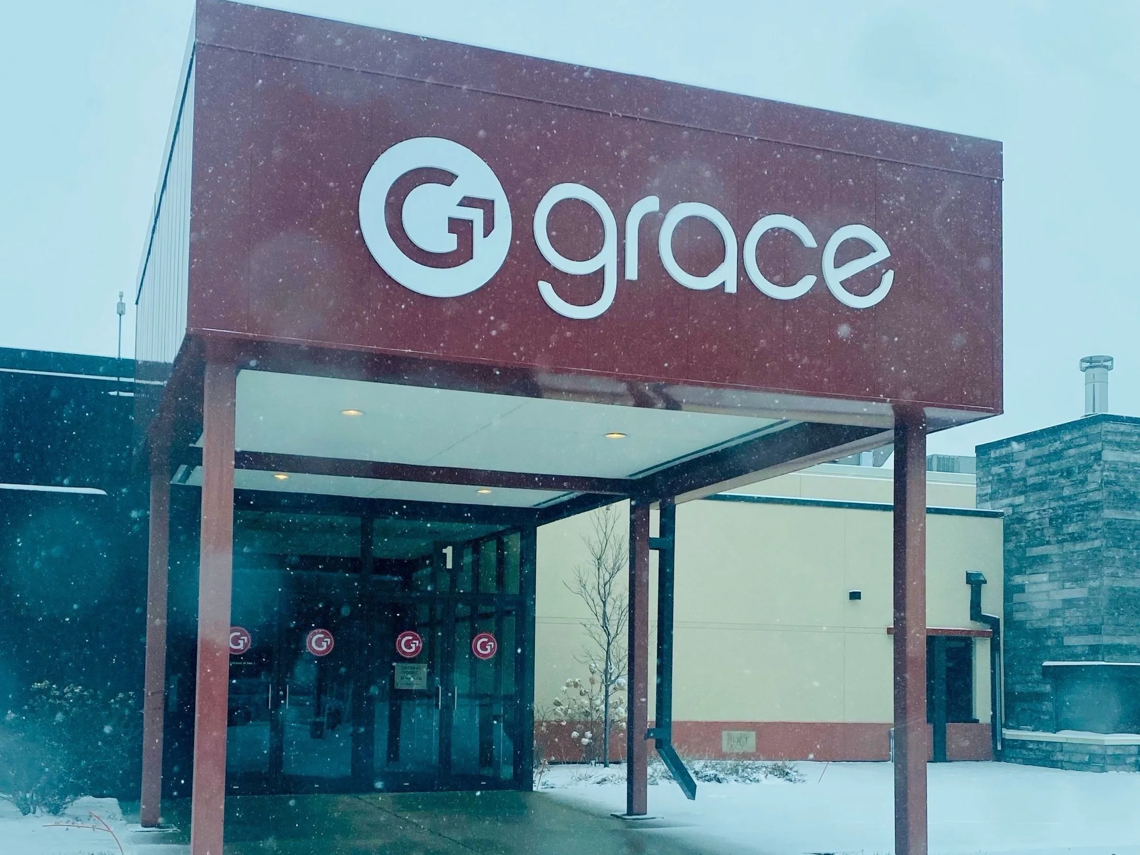
The final facelift features a clean hero graphic and balanced proportion, a more approachable font, and a subtle, playful touch.
It feels welcoming and modern, just like the brand it represents.


Brand Refresh Application
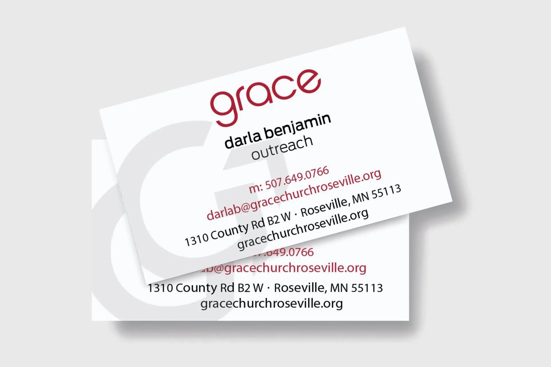
Grace’s previous brand guidelines were logo-focused (emphasis on the old “facet” patterned background). By revising them, I brought clarity and cohesion through the simplification of graphic elements, defined headline & body copy fonts and clear application examples across channels.
Grace Branding Ecosystem
Grace’s previous ministry branding (ex: kids program) felt disconnected to their broader “umbrella” brand:

Grace Kids logo before
The new umbrella/master brand refresh provided a great opportunity to align the Grace Kids (and at the time, possible child care center) branding to feel like one cohesive Grace ecosystem:
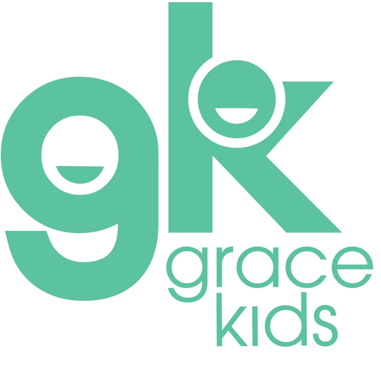
Grace Kids logo after
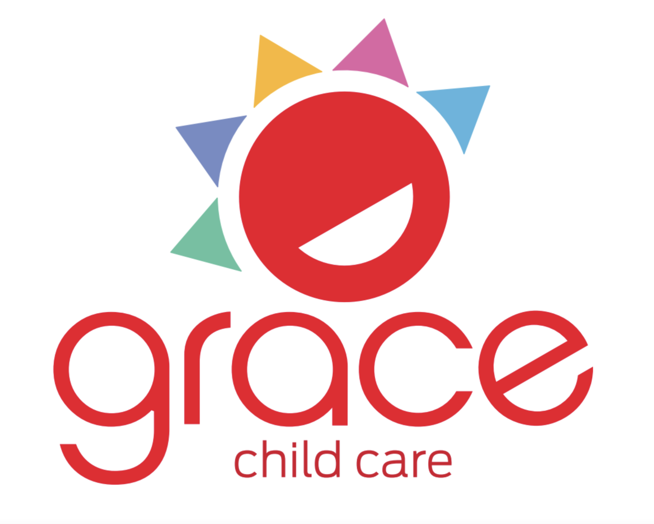
New Grace Child Care logo
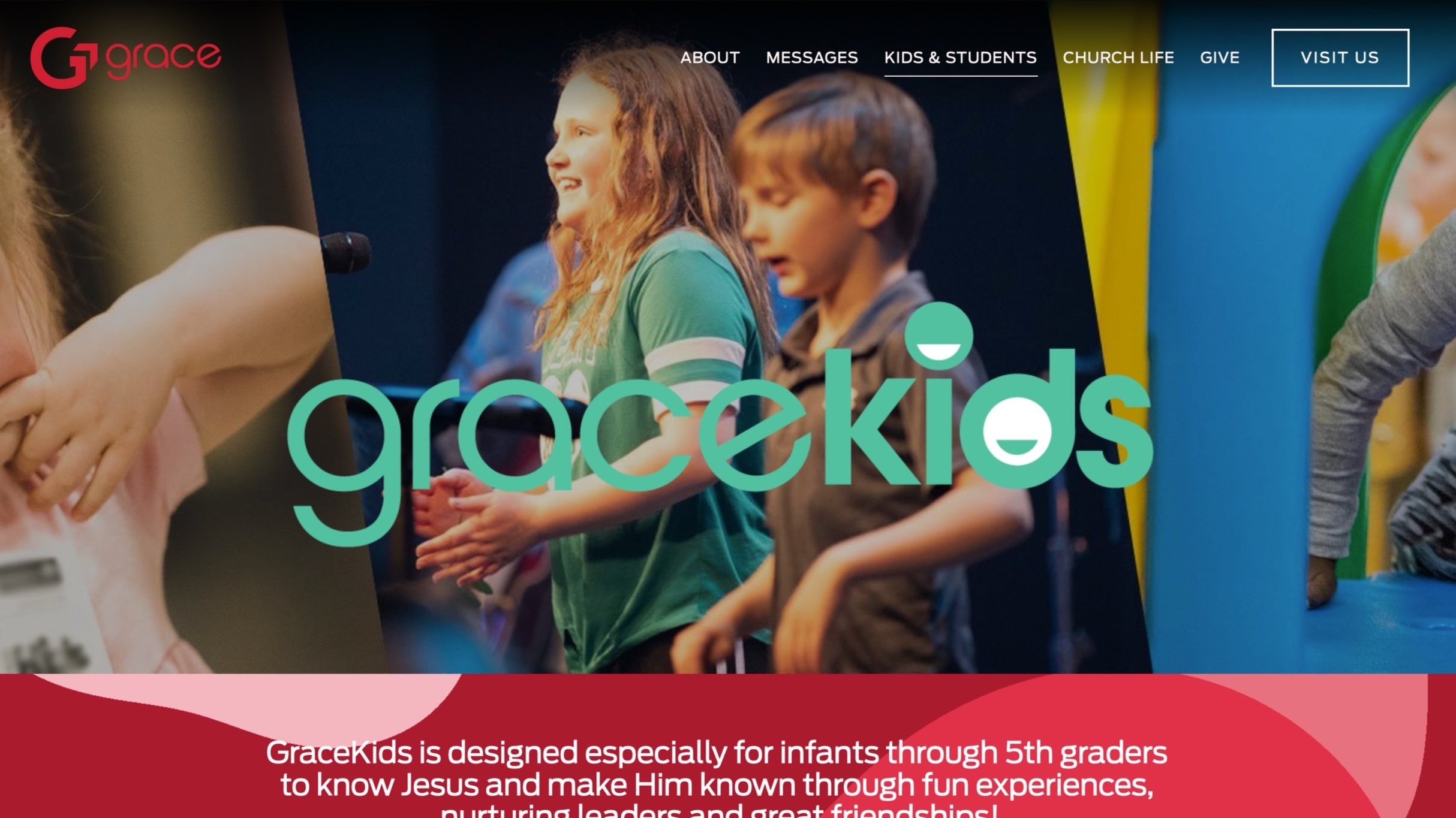
Kids Homepage Application (horizontal logo format)
Host Shirt Design
Grace’s previous host shirts felt like walking billboards — they lacked warmth and direction. I wanted to shift the focus to what hosts do best: welcome, guide, and provide.
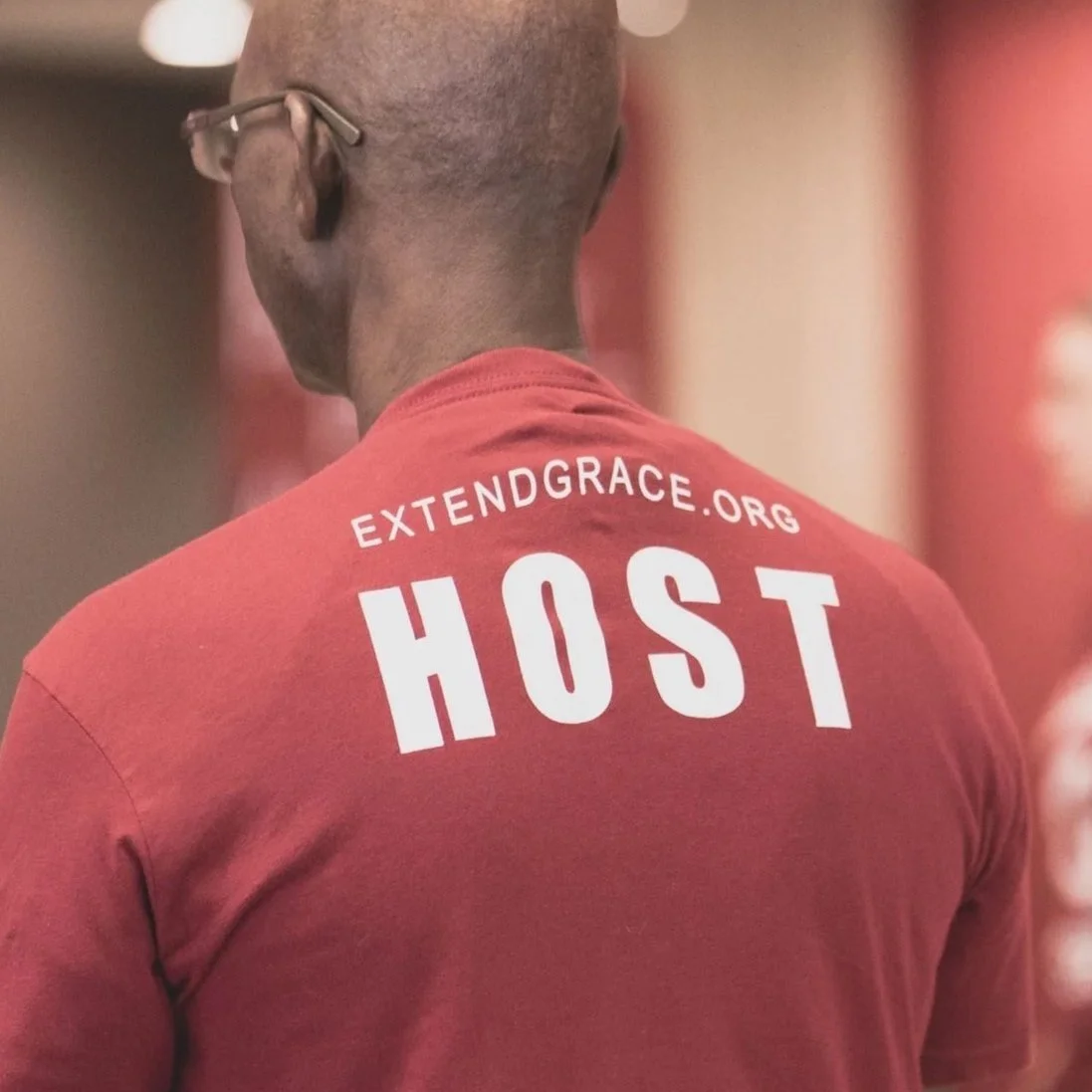
The new design is simple and friendly, like a hello at the front door.
A witty play on Grace’s tagline, “find Jesus, find hope” amplifies the brand persona on the back of each shirt.


Sermon Series Content Strategy—”To & Through” (Sermon Theme)
Logo,Stage Background & Social (IG/FB)


Sermon Series Content Strategy—”God Is” (Sermon Theme)
Opening Video & Social (IG/FB)


New Optimized Website
Development: Ministry Media Group
Brand & Creative Objectives:
Simplified architecture & navigation
More representation & diversity across creative assets
Front door” strategy (the homepage is like arriving at the virtual “welcome mat" of the church)
Updated branding: identity, fonts, color palate, voice/tone
Clean, modern visual approach
Cohesion between digital/social traffic drivers and destinations
Clearer mission, vision and values
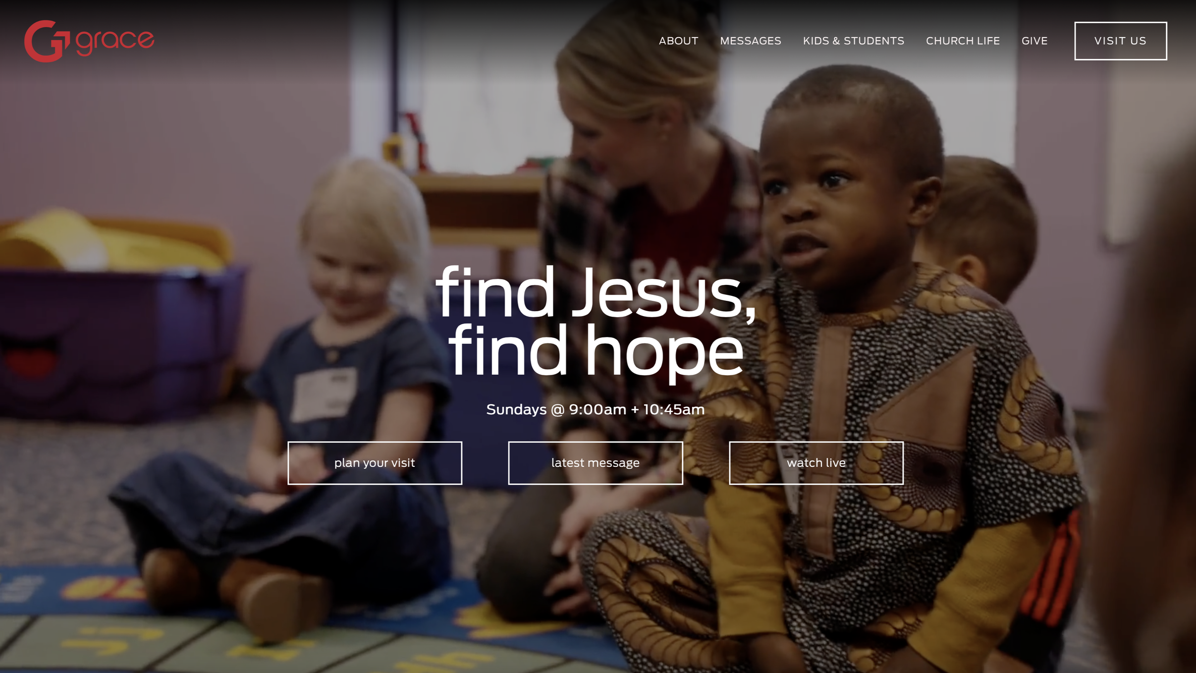
New homepage features an opening video with church family engaging in activities & conversation, along with new fonts, large tagline and three easy paths for the user to explore based on intent.
A critical aspect of Grace’s new site is the updated brand voice, which leans into three key attributes: warm, welcoming and approachable.
Brand Persona & Voice Application
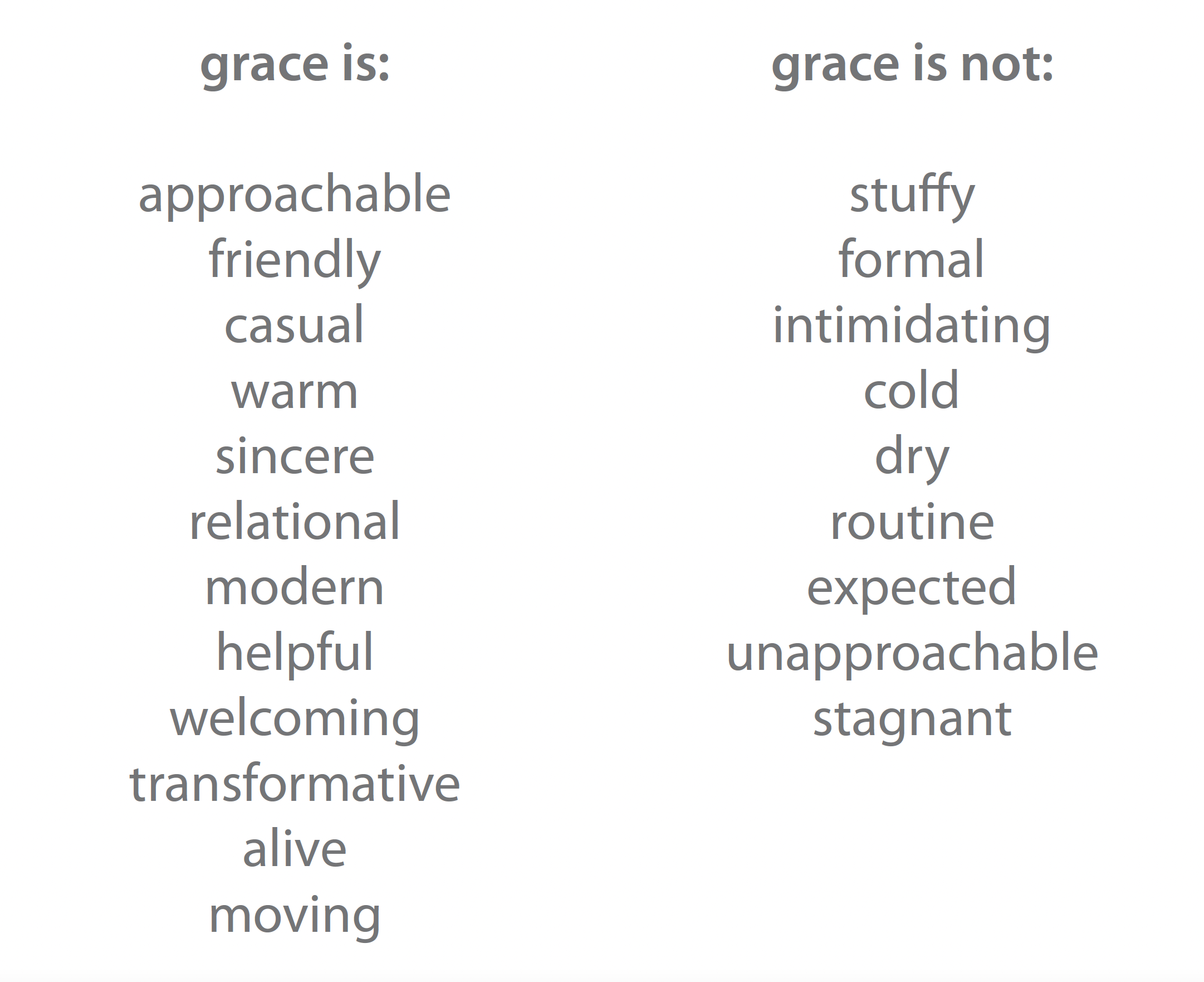
Brand Voice/ & Persona Exploration
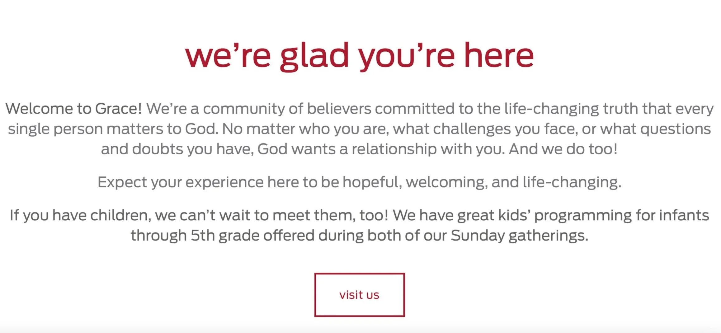
Brand Voice Application: New Home Page Intro
(first full month after launch)
Website visits +29%
Google profile views +52%
Search +73%
Dwell time + 40%
Exit & bounce rates down considerably
Site Performance